TP Knotweed Solutions
Launching a new website for nationwide knotweed removal specialists
Increase in sessions
Increase in page views
Increase in goal completions
“Team Zest have been involved with TP Knotweed since 2013 and have built multiple websites for us during this time. The new TP Knotweed website is a great showcase of our business and we are very happy with it. The team are committed to making everything they do a success. Thank you.”
— Tom Payne, Managing Director at TP Knotweed Solutions
Objective
TP Knotweed (TPK) are a leading provider of Japanese Knotweed removal services in the UK. Japanese Knotweed is an invasive plant which can cause significant damage to property, often preventing a sale and costing the owner hundreds of thousands of pounds to rectify. TPK excel at solving this problem for thousands of residential customers throughout the UK.
We began working with TPK in 2013 and have helped them to grow from a successful local business to leading nationwide experts. Their latest website release encompasses the progress in growth over the past few years and actions from our insights.
Why the time was right for a new website
Search has been a major part of TPK’s growth strategy, we’ve had great success over the years including 66% growth from 2016 to 2018. In order to reach new levels of success, we needed a new approach.
As content grew on the website, keyword cannibalisation crept in. This is where more than one page targets a specific keyword, and they end up competing against each other in the search engines. The success of some of our blog content had overpowered the service pages.
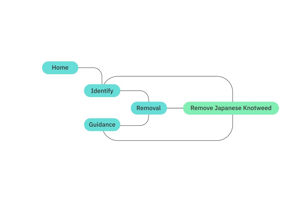
This latest website release focused on a major sitemap overhaul allowing TPK to be highly focused and lean in terms of pages. We combined insights from years of data with user experience (UX) insight to create a user journey that achieved the main objective for our users; ‘An easy path to remove Japanese Knotweed.’
The improved structure enabled our team to shift focus to the key service pages, so that they could rank for our key terms above other relevant long tail content. The purpose of this was to reduce the funnel and shorten the click-through path for the user to find out more about TPK’s service offering.
An evolution not revolution
Our team pitched and scheduled a new website release to tie in with the seasonal demand of TPK’s services. Despite obtaining agreement from TPK early on, we purposely delayed the build so that their peak time was not put at risk.
This is what strong partners do – they work together.
We were left with a limited window to plan the project. As with many of our web projects the aim was to break down the mammoth objectives into manageable chunks. The initial launch of the new user interface was the first step in our release schedule.
A new visual direction
Building on the brand colours we defined a new visual style. This included; new typography, new iconography, new photography styles, and a lot more white space. The result of this was an easier user interface to navigate, easier on the eye, and more fluid as a resource.
Clearing a path to conversion
People landing on our client’s website are typically all experiencing a common problem in their life: Japanese Knotweed. With this in mind, the job of the website is to make it easy for a user to start the process of removing the invasive species from their property. Our users were asking two related questions:
What is Japanese Knotweed?
How do I remove Japanese Knotweed?
Answering these queries and providing next step advice is the main objective for the site. We know this to be true through user persona research. Our team developed a set of customer avatars based on customer data and over five years of user analytics.
Once we understood the challenge, the user journey could be mapped out. The next step was to implement UX design principles on key pages of the user journey.
Getting the launch right
When launching a new website, it’s so important to have the right processes in place to recover from the inevitable dip of change.
When a new website is released, a search engine will typically ‘sandbox’ it whilst it reviews the content. This is to ensure that the change is positive and consistent with the history of the website. This prevents a good website turning bad once it’s built up some traffic.
So how did we combat this?
Firstly, the improved site structure was compatible with how search engines index content and how the hierarchy works. We made sure that this was considered and triple-checked.
We reviewed content across the site from blogs to service pages – ensuring the redirects were 100% accurate. We were killing off high traffic blog posts, so this move was risky and we needed to ensure that the relevant traffic was not lost.
Ensuring an improved structure worked in partnership with the optimised content. This ensured that there was no duplicate content on the website and that keywords were not being cannibalised anymore.
Each piece of content was mapped out against clear target keywords. This acts in the same way as a unique ID works, ensuring that one single page is responsible for a specific keyword.
We put in place regular testing and monitoring of performance to ensure that our team could respond to changes rapidly.
As we look to the future, we know that a website should never be ‘finished’. To maximise the effectiveness of a website and its marketing, it should evolve in response to the customer and their needs.
Growth team
-

Laura D
Head of Client Services
-

Tim P
Graphic Designer
-

Louis L
Head of Operations


